Card
A card is a sheet of material that serves as an entry point to more detailed information.
Import Syntax
Basic Usage

Card with Image
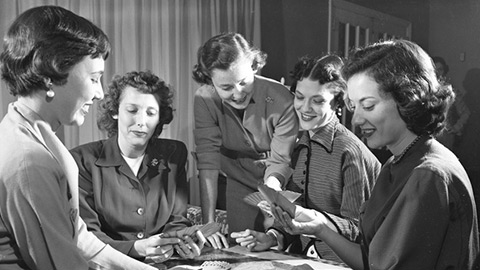
Cards can have full-bleed images with optional captions.
Shaped Cards

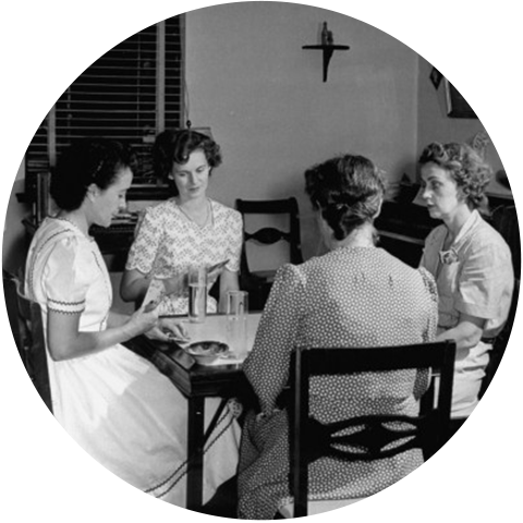
Another class shaped allows for a stylized version of the card meant to work with geometrically-shaped images.
With Bar
Card with Colored Bar
Every color in calcite can be used as a colored "bar" along the top of a card to provide a bit of visual punch with bar=" {color}"
Card with Colored Bar
Every color in calcite can be used as a colored "bar" along the top of a card to provide a bit of visual punch with bar=" {color}"
Card with Colored Bar
Every color in calcite can be used as a colored "bar" along the top of a card to provide a bit of visual punch with bar=" {color}"
Card with Colored Bar
Every color in calcite can be used as a colored "bar" along the top of a card to provide a bit of visual punch with bar=" {color}"
Wide Cards

Wide Cards
Wide cards are just like standard cards except that they are displayed in landscape orientation. This is useful in situations where there is too much content to display well in a standard card.
Generally, wide cards are meant to be displayed one-up, not grouped.
Props
Card default
| Property | Type | Required | Default | Description |
|---|---|---|---|---|
| children | Node | false | - | The content of the component. |
| bar | String | false | - | Style prop to show a colored bar across the top of the Card; can take a string for any color name in EsriColors. |
| shaped | Bool | false | - | Style prop to add a shape mask to the CardImage. |
| wide | Bool | false | - | Style prop to position Card content horizontally and fill the width of its container. |
CardContent
| Property | Type | Required | Default | Description |
|---|---|---|---|---|
| children | Node | false | - | The content of the component. |
CardImage
| Property | Type | Required | Default | Description |
|---|---|---|---|---|
| src | String | false | - | The HTML src property of the CardImage. |
| caption | String | false | - | The text content of the figure caption on the CardImage. |
| alt | String | false | - | The HTML alt property of the component. |
CardTitle
| Property | Type | Required | Default | Description |
|---|---|---|---|---|
| children | Node | false | - | The content of the component. |